When you buy through links on our articles, Future and its syndication partners may earn a commission.

iOS 18 arrived earlier this week, and with it came a whole bunch of impressive new features. Of those it’s clear that Apple Intelligence has been given the most attention. AI is a hot topic and this is Apple’s chance to show exactly what it’s capable of doing in the face of widespread competition. But that’s not my personal favorite iOS 18 feature.
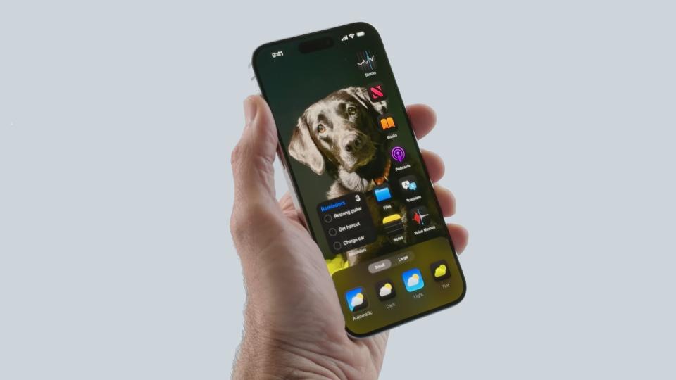
No, my favorite feature is something that I’ve been clamoring Apple to offer for years now. Ever since I got my first taste of the Android operating system 13 years ago, in fact. Imperfect as the implementation might be, I am loving that Apple is giving users the opportunity to take full control over the look of the home screen — and where the app icons are all placed.
Home Screen in iOS 18 — Gaps are Good


Back in 2011, when I first used an Android phone, there were a number of personalization features that made Apple’s home screen look childish in comparison. Not only did the app drawer mean apps didn’t need to live on the home screen, and be organized in some shape or form, there were a bunch more options.
There are a bunch of reasons why I’ve always sworn off iPhones. But the freedom to make my home screen look bizarre and disorganized to the casual observer — while making perfect sense to me — is one of them.
Those Android app icons could go just about anywhere you like, without snapping into an orderly list the way iOS did right up until this year. If you wanted to leave a gap on your home screen, that was absolutely something you could do. Some launchers even let you leave whole home screen pages blank, giving you a place to admire your wallpaper without any foreground interruptions. Plus, Android had widgets, which let you see and do certain things without ever having to open the app.
Over the years Apple has slowly added these features to iOS, though it’s taken a very long time to get there. Widgets arrived in a fashion with iOS 10, though they wouldn’t come to the home screen until 4 years later with iOS 14. iOS 14 also saw Apple launch the App Library, finally giving your stray apps somewhere to live that wasn’t the home screen. The following year iPadOS 15 gave tablet users the ability to place widgets wherever they liked.
It wasn’t until this year that this last freedom expanded to iPhones, and let you customize where your apps live on the lockscreen. And it’s about darn time too.
There are a bunch of reasons why I’ve always sworn off iPhones, compared to Android. Some of those things, like the consistent back button navigation, still haven’t happened yet. But the freedom to make my home screen look bizarre and disorganized to the casual observer (while making perfect sense to me) is one of them.
That said, as positive a step this is, Apple needs to do some tweaking on the implementation.
Some work is needed


The main problem with the new home-screen customization is that the old system is still clearly there. While it is possible to move icons around and place them wherever you like, the old-school grid format still comes into play sometimes. So when you move one icon, all the rest snap along to fill in the gap.
From the looks of things it all seems to be related to the very first square on the screen — situated in the top left under the time. If an app icon or widget is there, then everything you add next to it automatically snaps into the auto-correcting grid format.
Which is… weird. I understand that a lot of people might prefer the grid system, but the freedom to place icons wherever you like means you can always stick with the giant screen of app icons. It’s completely your choice. Trying to have both icon placement systems working in tandem just doesn’t work properly, and means someone could easily make a mistake and have to rearrange their whole home screen again.
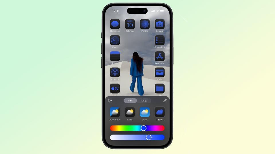
This little quirk reminded me that iOS 18 lets you change the color of your home screen to a different tone, but forces you to have the same color across every app and icon. It makes me wonder whether Apple just hasn’t really got the idea of “personalization” considering it spent so many years restricting just how much was actually offered.
But hey, it’s certainly a step forward, even if it means Apple should continue tweaking the implementation of this feature.
iOS 18: My bottom Line


Apple Intelligence may be the part of iOS 18 that makes all the headlines, but there’s still a lot of extra stuff in the update that is worth checking out. Improved personalization is one of those things, and it’s the kind of feature that Apple should have delivered several years ago. Because what good is a phone if you can’t make it truly your own?
Home screen personalization is imperfect, with Apple clinging onto the old auto-organizing grid system. Whether that’s deliberate or accidental, I’m not sure, but it’s the kind of thing that definitely needs fixing in a future iOS update. But for now I’m just glad that it’s actually happened, even if it took 17 years. Now if Apple can just figure out a way to offer a consistent back button…
